GitHub
 Twitter
Responsive sites for the win!
3 April 2016
Responsive sites are a bit more intelligent than a regular website. The pages on a responsite site adjust their layout to suit different devices. We access the internet with various devices these days: smart phones, tablets, desktop computers. A responsive site will display well on almost any device, which is why responsiveness is important.
Another technique which has become important is mobile first design. This is, as the name suggests, about designing the site for people using a mobile phone, before deciding how it will be viewed on larger screens. Depending on the site, up to two thirds of people will be viewing it on their mobile phone. The fact that this is increasing further promotes the use of mobile first design.
Something that helps with these techniques is the use of a framework. A web framework is a bunch of files that have styles and rules, which can be used by your website. Rather than writing all the styling and layout display, the framework can be called upon for what you want instead. Using a framework does have a few downsides though.
| Pros | Cons |
| Quickly make the page prettier | A lot of the downloaded code may not be used |
| Reduce time spent on generic issues | May have the desired effect for a specific site |
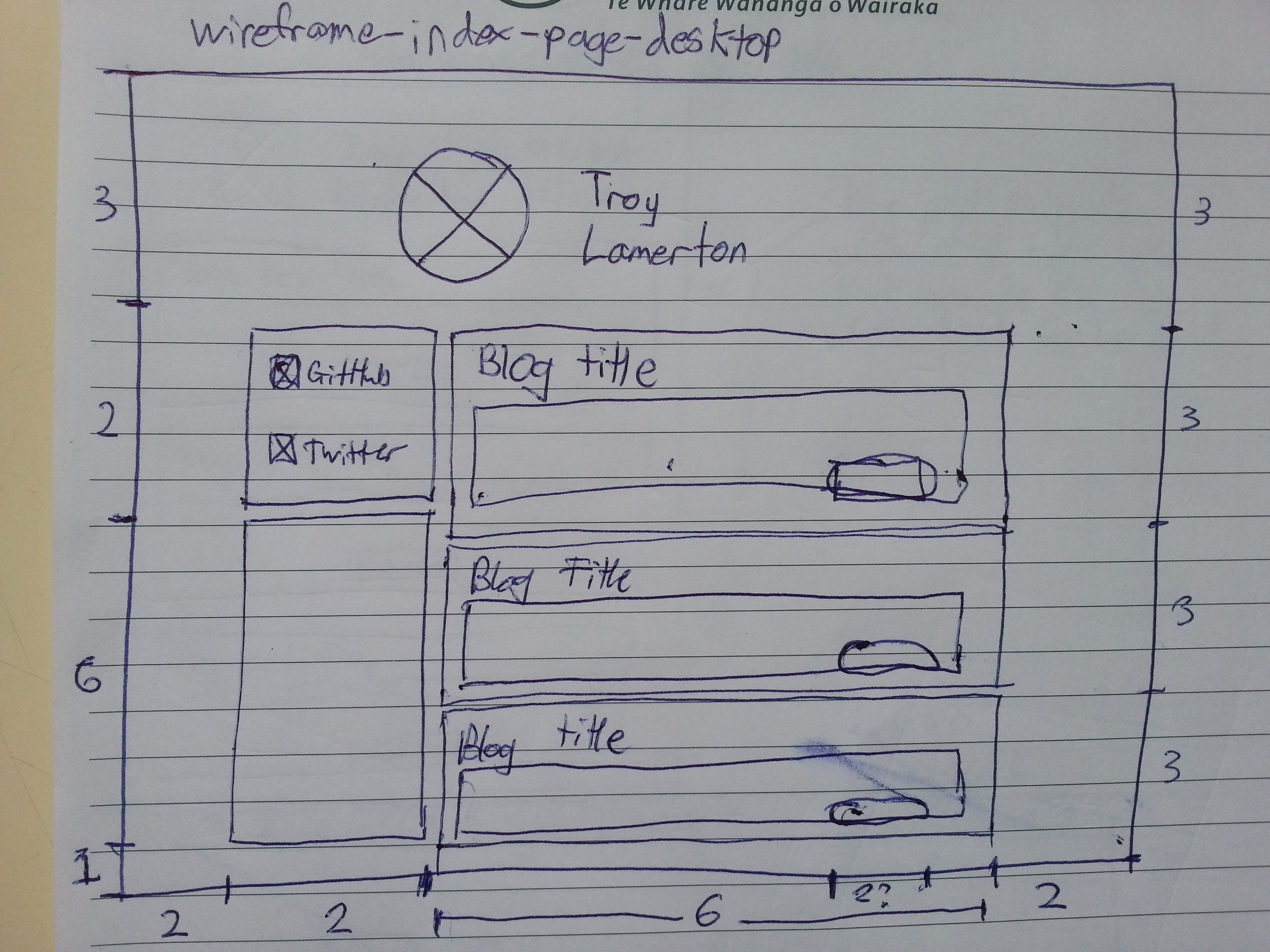
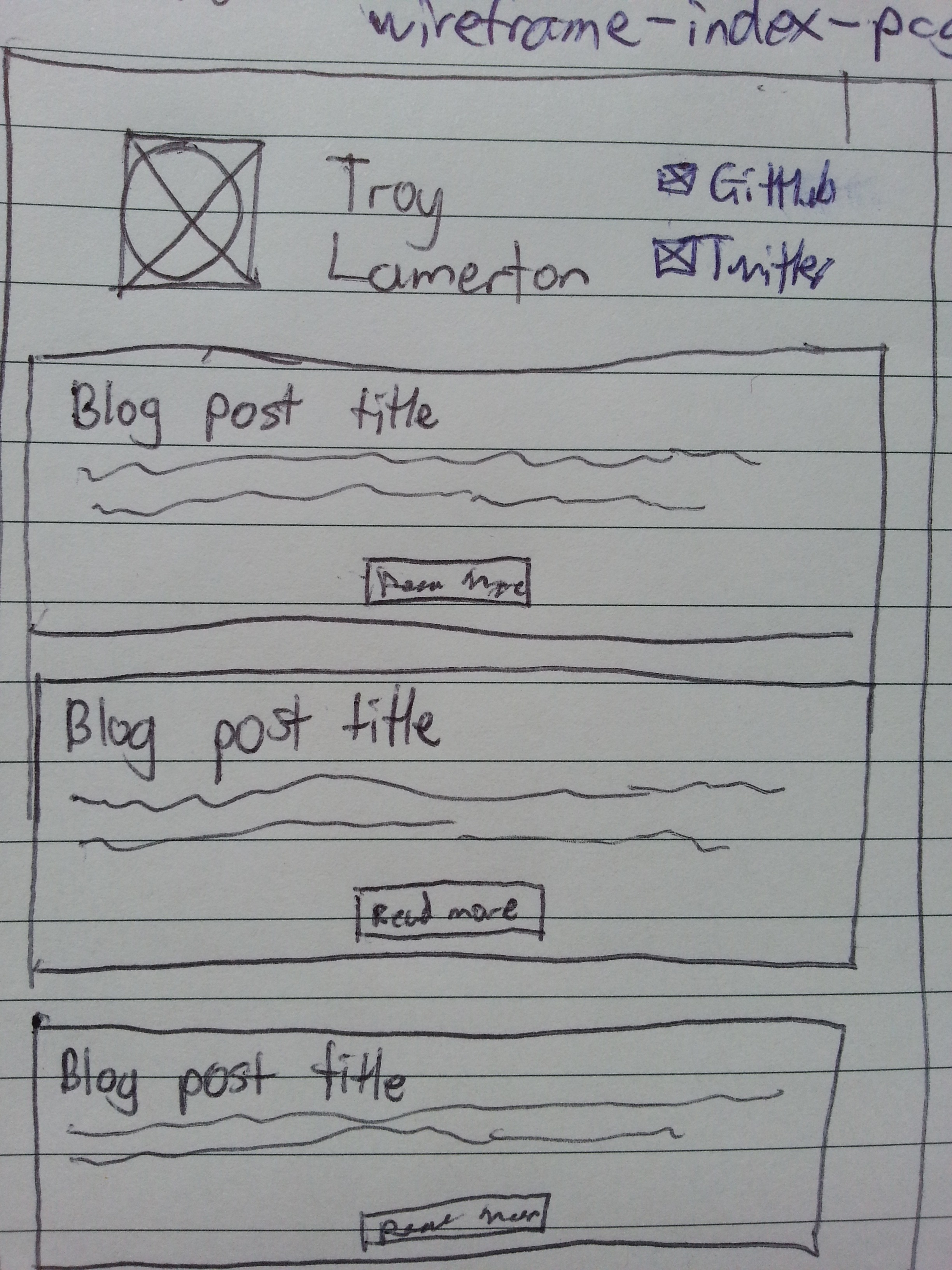
A wireframe is a simplified sketch of a webpage. We use wireframes to plan the layout of a webpage before building it. While building the webpage, the wireframe is used as a guide for the structure of the underlying code.